iOS Safari에서 IFrame을 반응 적으로 만드는 방법은 무엇입니까?
문제는 웹 사이트에 콘텐츠를 삽입하기 위해 IFrame을 사용해야 할 때 최신 웹 세계에서 IFrame도 반응 할 것입니다. 이론적으로는 간단하고 간단하게 사용 <iframe width="100%"></iframe>하거나 CSS 너비를 설정 iframe { width: 100%; }하지만 실제로는 그렇게 간단하지는 않지만 가능합니다.
iframe컨텐츠가 완전히 반응하고 내부 스크롤 막대없이 자체 크기를 조정할 수 있다면 iOS Safari는 iframe실제 문제없이 크기를 조정합니다 .
다음 코드를 고려하면 :
<html>
<head>
<meta http-equiv="X-UA-Compatible" content="IE=9,10,11" />
<meta name="viewport" content="width=device-width, initial-scale=1" />
<title>Iframe Isolation Test</title>
<style type="text/css" rel="stylesheet">
#Main {
padding: 10px;
}
</style>
</head>
<body>
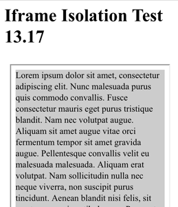
<h1>Iframe Isolation Test 13.17</h1>
<div id="Main">
<iframe height="950" width="100%" src="Content.html"></iframe>
</div>
</body>
</html>
와 Content.html :
<html>
<head>
    <meta http-equiv="X-UA-Compatible" content="IE=9,10,11" />
    <meta name="viewport" content="width=device-width, initial-scale=1" />
    <title>Iframe Isolation Test - Content</title>

    <style type="text/css" rel="stylesheet">

        #Main {
            width: 100%;
            background: #ccc;
        }

    </style>
</head>
<body>
    <div id="Main">
        <div id="ScrolledArea">
            Lorem ipsum dolor sit amet, consectetur adipiscing elit. Nunc malesuada purus quis commodo convallis. Fusce consectetur mauris eget purus tristique blandit. Nam nec volutpat augue. Aliquam sit amet augue vitae orci fermentum tempor sit amet gravida augue. Pellentesque convallis velit eu malesuada malesuada. Aliquam erat volutpat. Nam sollicitudin nulla nec neque viverra, non suscipit purus tincidunt. Aenean blandit nisi felis, sit amet ornare mi vestibulum ac. Praesent ultrices varius arcu quis fringilla. In vitae dui consequat, rutrum sapien ut, aliquam metus. Proin sit amet porta velit, suscipit dignissim arcu. Cras bibendum tellus eu facilisis sodales. Vestibulum posuere, magna ut iaculis consequat, tortor erat vulputate diam, ut pharetra sapien massa ut magna. Donec massa purus, pharetra sed pellentesque nec, posuere ut velit. Nam venenatis feugiat odio quis tristique.
        </div>
    </div>
</body>
</html>
그런 다음 iOS 7.1 Safari에서 문제없이 작동합니다. 아무 문제없이 가로와 세로를 바꿀 수 있습니다.

그러나 다음을 추가하여 간단히 Content.html CSS 를 변경하면 됩니다.
    #ScrolledArea {
        width: 100%;
        overflow: scroll;
        white-space: nowrap;
        background: #ff0000;
    }
당신은 이것을 얻는다 :

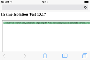
보시다시피, Content.html 컨텐츠가 완전히 반응하고 ( div # ScrolledArea 가 overflow: scroll설정 됨) iframe 너비가 100 % 인 경우에도 iframe 은 오버플로가 존재하지 않는 것처럼 여전히 div # ScrolledArea 의 전체 너비를 사용 합니다. 데모
이와 같은 경우 콘텐츠에 스크롤 영역이 있습니까? iframe 콘텐츠에 가로 스크롤 영역이있을 때 반응 iframe을 얻는 방법 iframe은 무엇입니까? 여기서 문제는 Content.html 이 응답하지 않는다는 사실이 아니라 iOS Safari가 단순히 iframe의 크기를 조정하여 div#ScrolledArea완전히 표시 되도록한다는 것입니다.
이 문제에 대한 해결책은 실제로 매우 간단하며 두 가지 방법이 있습니다. Content.html 을 제어 할 수 있으면 div#ScrolledArea너비 CSS를 다음과 같이 변경하십시오 .
        width: 1px;
        min-width: 100%;
        *width: 100%;
기본적으로 여기의 아이디어는 간단 width합니다.이를 뷰포트보다 작은 것으로 설정하고 (이 경우 iframe 너비) min-width: 100%실제로 width: 100%어떤 iOS Safari가 기본적으로 덮어 쓰 도록 허용합니다 . 이 *width: 100%;코드는 IE6 호환을 유지하지만 IE6에 신경 쓰지 않으면 생략 할 수 있습니다. 데모
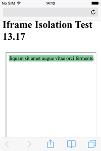
보시다시피 div#ScrolledArea너비는 실제로 100 %이며 할 overflow: scroll;수있는 일이 있으며 넘친 내용을 숨길 수 있습니다. iframe 컨텐츠에 액세스 할 수 있으면 이것이 좋습니다.
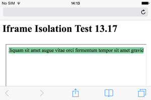
그러나 어떤 이유로 든 iframe 컨텐츠에 액세스 할 수없는 경우 실제로 iframe 자체에서 동일한 기술을 사용할 수 있습니다. iframe에서 동일한 CSS를 사용하기 만하면됩니다.
    iframe {
        width: 1px;
        min-width: 100%;
        *width: 100%;
    }
그러나 이것에는 한 가지 제한 scrolling="no"이 있습니다.이 작업을 수행하려면 iframe 에서 스크롤 막대를 꺼야합니다 .
<iframe height="950" width="100%" scrolling="no" src="Content.html"></iframe>
스크롤 막대가 허용되면 더 이상 iframe에서 작동하지 않습니다. 즉, Content.html을 대신 수정 하면 iframe에서 스크롤을 유지할 수 있습니다. 데모
문제는 포함 된 문서가 지정한 것보다 넓은 경우 Mobile Safari가 iFrame의 너비를 준수하지 않는 것입니다. 예:
데스크톱 브라우저에는 iFrame과 Div가 모두 300px로 설정되어 있습니다. 내용이 더 넓어 iFrame을 스크롤 할 수 있습니다.
그러나 모바일 사파리에서는 iFrame이 컨텐츠 너비로 자동 확장되는 것을 알 수 있습니다.
내 생각에 이것은 페이지 내에서 내용을 스크롤하는 데 오랫동안 지속되는 문제에 대한 해결 방법입니다. 과거에는 터치 장치에 큰 스크롤링 iframe이 있다면 페이지 자체 대신 스크롤되는 것처럼 iframe에 '고착'됩니다. Apple은 iFrame의 기본 동작이 '스크롤 없음'이라고 판단하여이를 방지하기 위해 확장 한 것으로 보입니다.
한 가지 옵션이이 해결 방법 일 수 있습니다. iFrame이 스크롤된다고 가정하는 대신, iframe을 제어 할 수있는 DIV에 배치하고 해당 스크롤을 허용하십시오.
예 : http://jsbin.com/zakedaja/1
마크 업 예 :
<div style="overflow: scroll; -webkit-overflow-scrolling: touch; width: 300px;">
   <iframe src="http://jsbin.com/roredora/1/" style="width: 600px;"></iframe>
</div>
모바일 사파리에서 이제 완전히 확장 된 iFrame의 컨텐츠를 포함하는 div를 통해 스크롤 할 수 있습니다.
캐치 : 이제 두 개의 스크롤 막대가 있으므로 데스크톱 브라우저에서보기 흉하게 보입니다. 따라서이 문제를 해결하려면 JS로 브라우저 감지를 수행해야 할 수도 있습니다.
크로스 브라우저 솔루션이 필요했습니다. 요구 사항은 다음과 같습니다.
- iOS와 다른 곳에서 모두 작동해야했습니다.
- iFrame의 콘텐츠에 접근 할 수 없습니다
- 스크롤해야합니다!
iOS의 scrolling = "no"와 관련 하여 @Idra 에서 배운 내용과 iOS의 화면에 iFrame 컨텐츠를 맞추는 방법에 대한 이 게시물 은 여기에 있습니다. 희망이 누군가를 도울 것입니다 =)
HTML
<div id="url-wrapper"></div>
CSS
html, body{
    height: 100%;
}

#url-wrapper{
    margin-top: 51px;
    height: 100%;
}

#url-wrapper iframe{
    height: 100%;
    width: 100%;
}

#url-wrapper.ios{
    overflow-y: auto;
    -webkit-overflow-scrolling:touch !important;
    height: 100%;
}

#url-wrapper.ios iframe{
    height: 100%;
    min-width: 100%;
    width: 100px;
    *width: 100%;
}
JS
function create_iframe(url){

    var wrapper = jQuery('#url-wrapper');

    if(navigator.userAgent.match(/(iPod|iPhone|iPad)/)){
        wrapper.addClass('ios');
        var scrolling = 'no';
    }else{
        var scrolling = 'yes';
    }

    jQuery('<iframe>', {
        src: url,
        id:  'url',
        frameborder: 0,
        scrolling: scrolling
    }).appendTo(wrapper);

}
이 모든 솔루션의 문제점은 iframe결코 변하지 않는 높이입니다 .
This means you won't be able to center elements inside the iframe using Javascript, position:fixed;, or position:absolute; since the iframe itself never scrolls.
My solution detailed here is to wrap all the content of the iframe inside a div using this CSS:
#wrap {
    position: fixed;
    top: 0;
    right:0;
    bottom:0;
    left: 0;
    overflow-y: scroll;
    -webkit-overflow-scrolling: touch;
}
This way Safari believes the content has no height and lets you assign the height of the iframe properly. This also allows you to position elements in any way you wish.
You can see a quick and dirty demo here.
This issue is also present on iOS Chrome.
I glanced through all the solutions above, most are very hacky.
If you don't need support for older browsers, just set the iframe width to 100vw;
iframe {
  max-width: 100%; /* Limits width to 100% of container */
  width: 100vw; /* Sets width to 100% of the viewport width while respecting the max-width above */
}
Note : Check support for viewport units https://caniuse.com/#feat=viewport-units
I am working with ionic2 and system config is as below-
******************************************************

Your system information:

Cordova CLI: 6.4.0
Ionic Framework Version: 2.0.0-beta.10
Ionic CLI Version: 2.1.8
Ionic App Lib Version: 2.1.4
ios-deploy version: Not installed
ios-sim version: 5.0.8
OS: OS X Yosemite
Node Version: v6.2.2
Xcode version: Xcode 7.2 Build version 7C68


******************************************************
For me this issue got resolved with this code-
for html iframe tag-
<div class="iframe_container">
      <iframe class= "animated fadeInUp" id="iframe1" [src]='page' frameborder="0" >
        <!--  <img src="img/video-icon.png"> -->
      </iframe><br>
   </div>
See css of the same as-
.iframe_container {
  overflow: auto;
  position: relative;
  -webkit-overflow-scrolling: touch;
  height: 75%;
}

iframe {
  position:relative;
  top: 2%;
  left: 5%;
  border: 0 !important;
  width: 90%;
}
Position property play a vital role here in my case.
position:relative;
It may help you too!!!
CSS only solution
HTML
<div class="container">
    <div class="h_iframe">
        <iframe  src="//www.youtube.com/embed/9KunP3sZyI0" frameborder="0" allowfullscreen></iframe>
    </div>
</div>
CSS
html,body {
    height:100%;
}
.h_iframe iframe {
    position:absolute;
    top:0;
    left:0;
    width:100%;
    height:100%;
}
Another demo here with HTML page in iframe
I had an issue with width on the content pane creating a horizontal scroll bar for the iframe. It turned out that an image was holding the width wider than expected. I was able to solve it by setting the all of the images css max-width to a percent.
<meta name="viewport" content="width=device-width, initial-scale=1" />

img {
        max-width: 100%;
        height:auto;
    }
in fact for me just worked in ios disabling the scroll
<iframe src="//www.youraddress.com/" scrolling="no"></iframe>
and treating the OS via script.
For me CSS solutions didn't work. But setting the width programmatically does the job. On iframe load set the width programmatically:
$('iframe').width('100%');
참고 URL : https://stackoverflow.com/questions/23083462/how-to-get-an-iframe-to-be-responsive-in-ios-safari
'IT story' 카테고리의 다른 글
| 정밀도와 스케일의 차이점은 무엇입니까? (0) | 2020.07.02 |
|---|---|
| ViewPager가 화면 외부보기를 파괴하지 못하도록 방지 (0) | 2020.07.02 |
| NSArray에 CGPoint 객체를 쉽게 추가하는 방법은 무엇입니까? (0) | 2020.07.02 |
| 링크 호버에 페이드 효과? (0) | 2020.07.02 |
| rpm 자동 설치 종속성을 만드는 방법 (0) | 2020.07.02 |