부트 스트랩 3.0 탐색 모음 높이 감소
고정 된 상단 동작과 함께 사용되는 부트 스트랩 3.0 탐색 모음 높이를 줄이려고합니다. 여기에 코드를 사용하고 있습니다.
HTML
<div class="tnav">
<div class="navbar navbar-fixed-top" role="banner">
    <div class="navbar-inner-sm">
  <div class="container">
    <div class="navbar-header">
      <button class="navbar-toggle" type="button" data-toggle="collapse" data-target=".bs-navbar-collapse">
        <span class="sr-only">Toggle navigation</span>
        <span class="icon-bar"></span>
        <span class="icon-bar"></span>
        <span class="icon-bar"></span>
      </button>
    </div>
    <nav class="collapse navbar-collapse" role="navigation">
      <ul class="nav navbar-nav pull-right">
        <li class="active">
          <a href="../getting-started">Getting started</a>
        </li>
        <li>
          <a href="../css">Ext01</a>
        </li>
        <li>
          <a href="../components">Language</a>
        </li>
        <li>
          <a href="../javascript">My Account</a>
        </li>
        <li>
          <a href="../customize">Sign Out</a>
        </li>
      </ul>
    </nav>
  </div>
    </div>
</div>
CSS
.tnav .navbar { background:#F06; height:30px; }
.navbar-inner-sm{background-color: #282828;padding: 1px 20px;background-repeat: repeat-x;-webkit-box-shadow: 0 1px 3px rgba(0, 0, 0, .25), inset 0 -1px 0 rgba(0, 0, 0, .1);-moz-box-shadow: 0 1px 3px rgba(0, 0, 0, .25), inset 0 -1px 0 rgba(0, 0, 0, .1);box-shadow: 0 1px 3px rgba(0, 0, 0, .25), inset 0 -1px 0 rgba(0, 0, 0, .1);background-image: linear-gradient(top, #333333, #222222);}
.navbar-inner-sm .nav {position: relative;left: 0;display: block;float: left;margin: 0 10px 0 0;}
.navbar-inner-sm .nav.pull-right {float: right;}
.navbar-inner-sm .nav > li {display: block;float: left;}
.navbar-inner-sm .nav > li > a {float: none;padding: 4px 5px;line-height: 19px;color: #999999;text-decoration: none;text-shadow: 0 -1px 0 rgba(0, 0, 0, 0.25);}
.navbar-inner-sm .nav > li > a:hover {background-color: transparent;color: #ffffff;text-decoration: none;}
.navbar-inner-sm .nav .active > a,.navbar .nav .active > a:hover {color: #ffffff;text-decoration: none;background-color: #003753;}
.navbar-inner-sm .divider-vertical {height: 27px;width: 1px;margin: 0 9px;overflow: hidden;background-color: #282828;border-left: 1px solid #3f3f3f; border-right: 1px solid #161616;}
.navbar-inner-sm .nav.pull-right {margin-left: 10px;margin-right: 0;}
결과
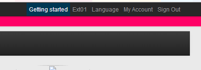
화면에서 탐색 막대가 출력에서 감소했지만 높이는 감소하지 않습니다. 원래 높이는 분홍색으로 표시됩니다.
위의 CSS 스크립트는 부트 스트랩 2에서 거의 잘 작동합니다. *
높이를 올바르게 낮추는 방법이 있습니까?
몇 시간을 보낸 후 다음 CSS 클래스를 추가하면 문제가 해결되었습니다.
Bootstrap 3.0으로 작업하십시오. *
.tnav .navbar .container { height: 28px; }
부트 스트랩 3.3.4 작업
.navbar-nav > li > a, .navbar-brand {
    padding-top:4px !important;
    padding-bottom:0 !important;
    height: 28px;
}
.navbar {min-height:28px !important;}
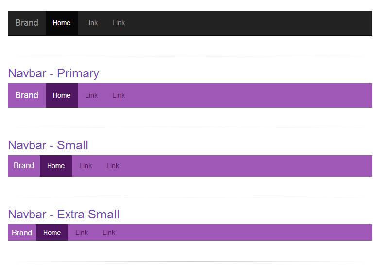
스크린 샷으로 네비게이션 바의 높이를 사용자 정의하고 줄이기 위해 완전한 코드를 업데이트 하십시오.
CSS :
/* navbar */
.navbar-primary .navbar { background:#9f58b5; border-bottom:none; }
.navbar-primary .navbar .nav > li > a {color: #501762;}
.navbar-primary .navbar .nav > li > a:hover {color: #fff; background-color: #8e49a3;}
.navbar-primary .navbar .nav .active > a,.navbar .nav .active > a:hover {color: #fff; background-color: #501762;}
.navbar-primary .navbar .nav li > a .caret, .tnav .navbar .nav li > a:hover .caret {border-top-color: #fff;border-bottom-color: #fff;}
.navbar-primary .navbar .nav > li.dropdown.open.active > a:hover {}
.navbar-primary .navbar .nav > li.dropdown.open > a {color: #fff;background-color: #9f58b5;border-color: #fff;}
.navbar-primary .navbar .nav > li.dropdown.open.active > a:hover .caret, .tnav .navbar .nav > li.dropdown.open > a .caret {border-top-color: #fff;}
.navbar-primary .navbar .navbar-brand {color:#fff;}
.navbar-primary .navbar .nav.pull-right {margin-left: 10px; margin-right: 0;}
.navbar-xs .navbar-primary .navbar { min-height:28px; height: 28px; }
.navbar-xs .navbar-primary .navbar .navbar-brand{ padding: 0px 12px;font-size: 16px;line-height: 28px; }
.navbar-xs .navbar-primary .navbar .navbar-nav > li > a {  padding-top: 0px; padding-bottom: 0px; line-height: 28px; }
.navbar-sm .navbar-primary .navbar { min-height:40px; height: 40px; }
.navbar-sm .navbar-primary .navbar .navbar-brand{ padding: 0px 12px;font-size: 16px;line-height: 40px; }
.navbar-sm .navbar-primary .navbar .navbar-nav > li > a {  padding-top: 0px; padding-bottom: 0px; line-height: 40px; }
사용 코드 :
<div class="navbar-xs">
   <div class="navbar-primary">
       <nav class="navbar navbar-static-top" role="navigation">
          <!-- Brand and toggle get grouped for better mobile display -->
          <div class="navbar-header">
              <button type="button" class="navbar-toggle" data-toggle="collapse" data-target="#bs-example-navbar-collapse-8">
                 <span class="sr-only">Toggle navigation</span>
                 <span class="icon-bar"></span>
                 <span class="icon-bar"></span>
                 <span class="icon-bar"></span>
              </button>
              <a class="navbar-brand" href="#">Brand</a>
          </div>
          <!-- Collect the nav links, forms, and other content for toggling -->
          <div class="collapse navbar-collapse" id="bs-example-navbar-collapse-8">
              <ul class="nav navbar-nav">
                  <li class="active"><a href="#">Home</a></li>
                  <li><a href="#">Link</a></li>
                   <li><a href="#">Link</a></li>
              </ul>
          </div><!-- /.navbar-collapse -->
      </nav>
  </div>
</div>
작업 솔루션 :
Bootstrap 3.0은 기본적으로 상단과 하단에 15px 패딩이 있으므로 무시해야합니다!
예를 들면 다음과 같습니다.
.navbar-nav > li > a {padding-top:10px !important; padding-bottom:10px !important;}
.navbar {min-height:40px !important}
다음과 같이 .navbar에 설정된 최소 높이를 무시하십시오.
.navbar{
  min-height:20px; //* or whatever height you require
}
Altering an elements height to something smaller than the min-height won't make a difference...
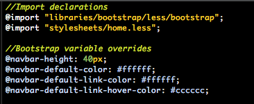
if you are using the less source, there should be a variable for the navbar height in the variables.less file. If you are not using the source, then you can customize it using the customize utilty that bootstrap's site provides. And then you can downloaded it and include it in your project. The variable you are looking for is: @navbar-height
This is my experience
 .navbar { min-height:38px;   }
 .navbar .navbar-brand{ padding: 0 12px;font-size: 16px;line-height: 38px;height: 38px; }
 .navbar .navbar-nav > li > a {  padding-top: 0px; padding-bottom: 0px; line-height: 38px; }
 .navbar .navbar-toggle {  margin-top: 3px; margin-bottom: 0px; padding: 8px 9px; }
 .navbar .navbar-form { margin-top: 2px; margin-bottom: 0px }
 .navbar .navbar-collapse {border-color: #A40303;}
The only way that worked for me is explained at this link: How do you decrease navbar height in Bootstrap 3?
It decreases navbar height with just two lines of code
If you guys are generating your stylesheets with LESS/SASS and are importing Bootstrap there, I've found that overriding the @navbar-height variable lets your set the height of the navbar, which is originally defined in the variables.less file.
I think we can write this fewer styles, without changing the existing color. The following worked for me (in Bootstrap 3.2.0)
.navbar-nav > li > a { padding-top: 5px !important; padding-bottom: 5px !important; }
.navbar { min-height: 32px !important; }
.navbar-brand { padding-top: 5px; padding-bottom: 10px; padding-left: 10px; }
The last one ('navbar-brand') is actually needed only if you have text as your 'brand' name.
Wanted to added my 2 pence and a thank you to James Poulose for his original answer it was the only one that worked for my particular project (MVC 5 with the latest version of Bootstrap 3).
This is mostly aimed at beginners, for clarity and to make future edits easier I suggest you add a section at the bottom of your CSS file for your project for example I like to do this:
/* Bootstrap overrides */

.some-class-here {
}
Taking James Poulose's answer above I did this:
/* Bootstrap overrides */
.navbar-nav > li > a { padding-top: 8px !important; padding-bottom: 5px !important; }
.navbar { min-height: 32px !important; }
.navbar-brand { padding-top: 8px; padding-bottom: 10px; padding-left: 10px; }
I changed the padding-top values to push the text down on my navbar element. You can pretty much override any Bootstrap element like this and its a good way of making changes without screwing up the Boostrap base classes because the last thing you want to do is make a change in there and then lose it when you updated Bootstrap!
Finally for even more separation I like to split up my CSS files and use @import declarations to import your sub-files into one main CSS File for easy management for example:
@import url('css/mysubcssfile.css');
note: if you're pulling in multiple files you need to make sure they load in the right order.
Hope this helps someone.
나는 같은 문제가 있는데 부트 스트랩이 제공하는 메뉴 막대의 높이가 너무 커서 실제로 잘못된 부트 스트랩을 다운로드 한 다음이 사이트에서 orignal 부트 스트랩을 다운로드하여 제거합니다 .. http://getbootstrap.com/2.3 .2 / yii (netbeans)에서 부트 스트랩을 사용하려는 경우 https://www.youtube.com/watch?v=XH_qG8gphaw 이 자습서를 따르십시오 . 음성은 없지만 단계가 느리므로 쉽게 이해하고 구현할 수 있습니다. 그들. 감사
참고 URL : https://stackoverflow.com/questions/18599778/decreasing-height-of-bootstrap-3-0-navbar
'IT story' 카테고리의 다른 글
| PHP에서 한 배열의 요소가 다른 배열에 있는지 확인 (0) | 2020.08.05 |
|---|---|
| Objective-C에서 객체 속성 목록 가져 오기 (0) | 2020.08.05 |
| 랜덤 가우스 변수 (0) | 2020.08.05 |
| 90 년대 초 HTML 양식은 어떻게 해석 되었습니까? (0) | 2020.08.05 |
| 안드로이드 앱에서 홀로 다크 테마를 설정하는 방법은 무엇입니까? (0) | 2020.08.05 |